"The challenge: how to overcome the negative image of wine sold in pouches or as a 'bag in a box', which is often synonymous with poor quality?
This was the question has to answer by the creative agency REVERSE Innovation in order to develop a structural pack that appeals to a demanding but conventional audience.
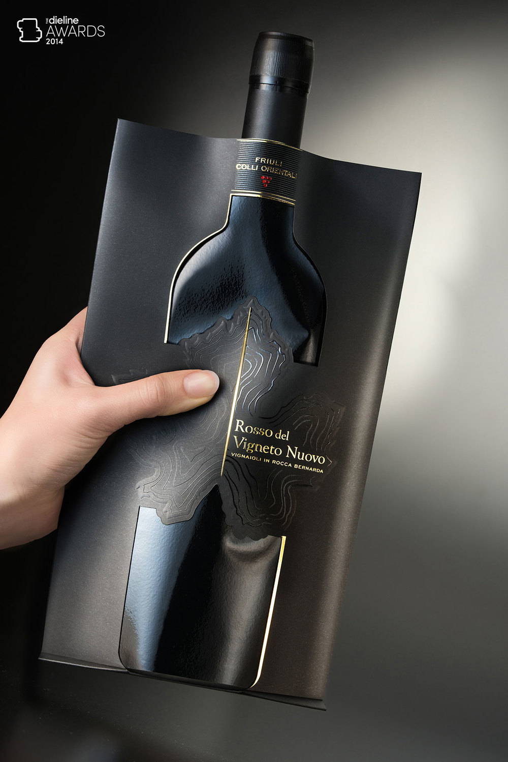
The result is a truly innovative design that cleverly and elegantly reinterprets the classic 'Bordeaux' bottle by means of an intriguing play of solid areas and empty spaces, emphasized by the contrasting opaque and gloss surfaces of the materials used.
The crucial importance of the geographical origin of the grape and the concept of terroir is enhanced by the use of blind embossing and UV varnish to reproduce the distinctive terracing of the vineyard.
The naturally irregular but almost concentric patterns recall the rows of vines growing on softly undulating slopes. The illustration of the vineyard location even uses the specific shape of the local vine leaf, which is characteristic of this splendid wine-producing area.
A new vineyard, a new blend, and a pioneering approach to a very traditional sector of packaging. Its the first step of an alternative journey of discovery and innovation."
Wine Pouch (R)evolution has won The Dieline, Fab Awards, A Design Award, How Design Awards and Good Design from Chicago Athenaeum Museum.
[ add comment ] ( 167 views ) | permalink |

 ( 3.1 / 1988 )
 Calendar